Infection Prevention Control (IPC) Application
Overview
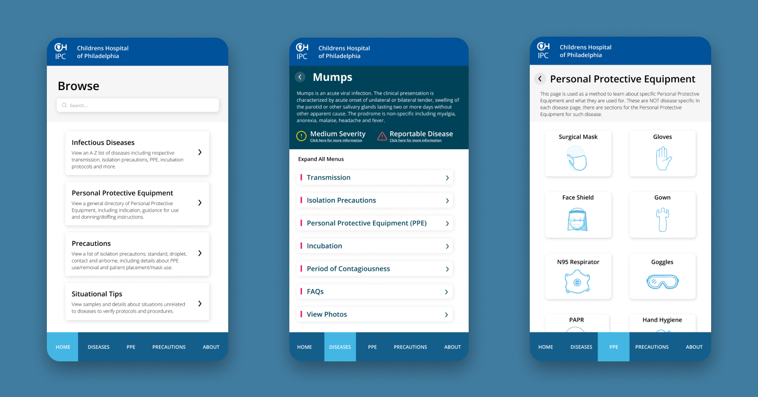
For my Senior Design Capstone project, we teamed up with the Infection Prevention and Control team at the Children’s Hospital of Philadelphia to create a consolidated mobile application consisting of information pertaining to infectious diseases. With the recent Coronavirus outbreak, taking safe precautions and being knowledgeable about how the specific virus works is crucial for everyone’s safety. Our projects solves an ongoing issue with physicians and nurses being unaware of the correct protocols to take for patients with infectious diseases.
My Role
Lead UX Designer + Researcher
Timeline
September 2020 – May 2021
Tools + Prototype
Figma | View prototype
Awards
Communicator Awards
The leading international awards program recognizing excellence in communication across a spectrum of
industries, championing effective and meaningful work. The Communicator Awards is sanctioned and judged by the Academy of Interactive & Visual Arts.
Drexel University
The College of Computing and Informatics holds annual awards for Senior Capstone Projects for a variety of categories. Projects are judged in a multi-level competition on originality, compliance with software engineering principles, completion, and their successful deployment.
Problem
The Infection Prevention and Control team was overwhelmed with physicians redundantly calling about questions regarding PPE usage, all of which the answers are already documented somewhere. This causes a delay in making informed and important decisions, which prevents the thorough protection of physicians and patients. There were about 366 calls per month.
Our Goal
This project gives physicians and nurses the ability to access important information (like personal protective equipment and symptoms) about a multitude of infectious diseases – from paper to digital. This app helps eliminate the time taken by the physicians to call the Infection Prevention Team in order to get specific PPE instructions about a particular disease.

User Research
This project was conducted during the height of the pandemic, which ultimately disrupted our communication with the physicians and nurses of the Children’s Hospital of Philadelphia. Their time for our research was extremely sensitive, which resulted in our team having a small sample size of data to evaluate. We spoke to 3 nurses and 3 physicians during the course of the project.
Our research followed conventional qualitative methods such as interviews and usability testing due to the availability constraint to conduct quantitative methods. This was our biggest challenge, however, we were able to successfully design and create our prototype with tremendous positive feedback.
The recurring pain point among our users was the time spent on finding documents and calling the Infection Prevention and Control team to answer questions. All of this data exists in either physical or digital form, however, none of it was consolidated and our users struggled constantly with locating this data.
Research Methodologies
Interviews:
With our 6 participants, we conducted interviews to understand the pain points and needs for building our prototype. We questioned our users about their general behavior with using medical applications to gauge usability practices. We followed up with questions regarding the process they follow with handling a patient to ultimately streamline that process into a mobile application.
Usability Testing:
Following our interviews and upon completion of our low-mid fidelity prototypes, we conducted usability testings that consisted of a variety of tasks we asked our users to complete. This was our most beneficial research method – it allowed us to visually evaluate how our users interacted with the app and to pinpoint any interaction issues.
User Persona
Name:
Courtney Bogan
Age:
26
Hometown:
Philadelphia
Occupation:
Infection Preventionist/Registered Nurse
Goals:
- Prevention of illness
- Be able to more efficiently prepare for patients
- Less phone calls to IPC team for questions
Pain Points:
- Spends too much time looking for documents
- Unprepared often with PPE relative to disease
Wireframing + Prototyping
Design Approach:
The ultimate goal here is to create a product that streamlines the original workflow to make it as efficient as possible, which allows physicians and nurses to access these documents within an app on their personal devices rather than unorganized physical and digital documents.
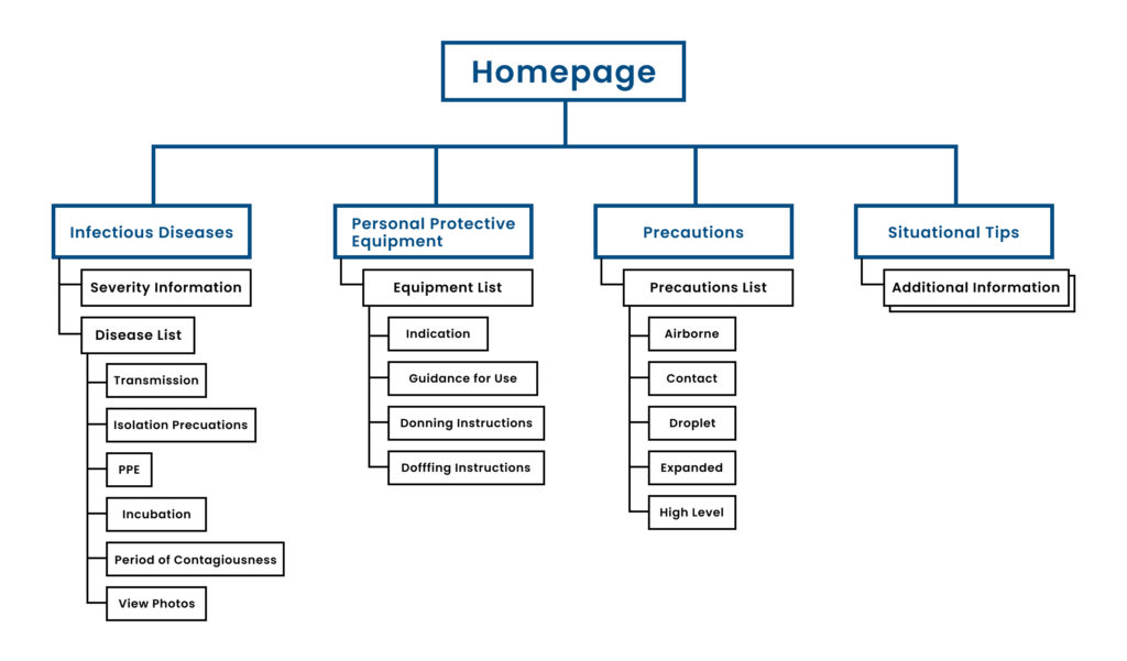
We decided to focus primarily on information architecture and hierarchy. We knew this app was going to be flooded with information, so navigation and information structure were our priorities.
Designs
01. Low-Fidelity:
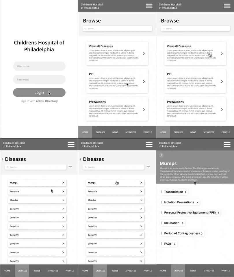
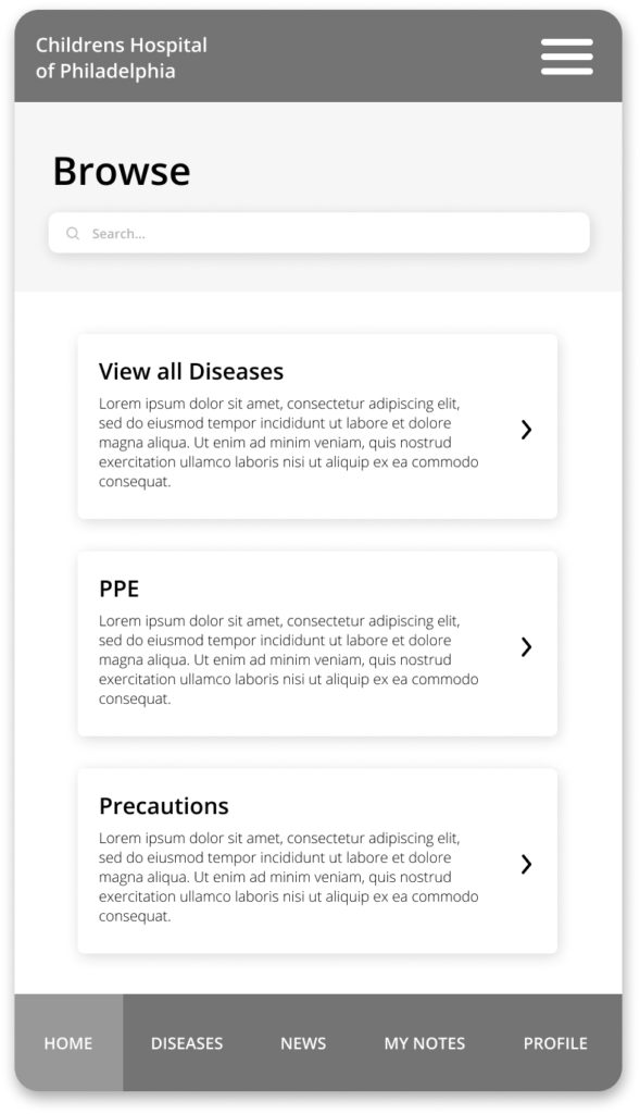
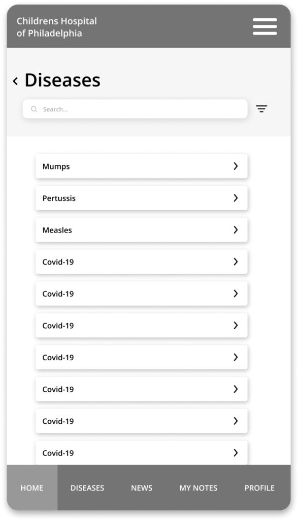
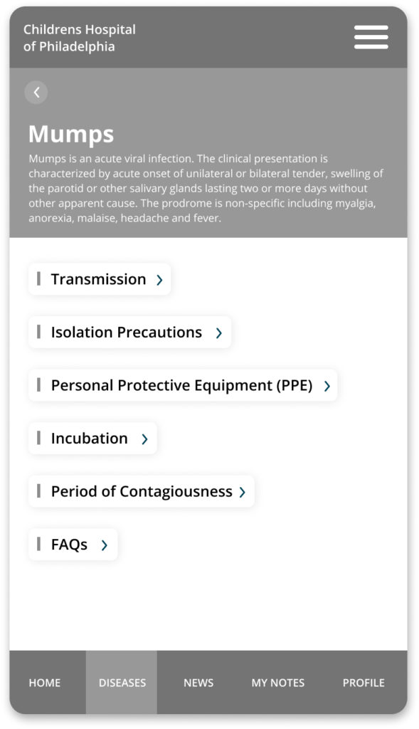
After conducting our foundational research with the feedback from our interviews, we were able to create a wireframe prototype to use in our first round of usability testing sessions. The medical information was provided to us from the Children’s Hospital of Philadelphia.
Low-Fidelity Wireframes:
Low-Fidelity Usability Testing – Findings:
- Users found the overall structure and navigation simple and seamless
- Users felt necessary foundational information was provided
- Users needed to see more content to assess feasibility of accessing and finding information
“I believe this app will enable the bedside clinicians to find everything they need to know about infections, viruses, and their respective precautions. This will empower the bedside clinicians to care for their patients safely with decreased reliance on the Infection Prevention Team on a daily basis.” – Courney Bogan, Registered Nurse
02. Mid-Fidelity:
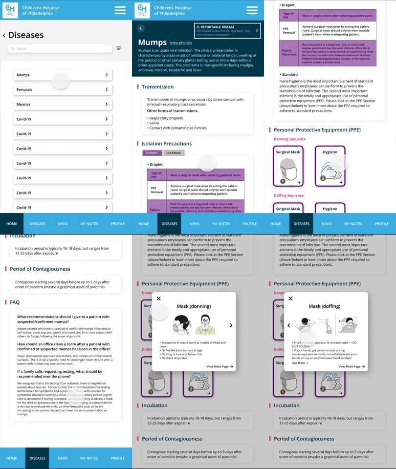
We introduced color, icons, more content, and interactive elements to our mid-fidelity prototype. We received more content, so we were able to build out more pages and features. From our findings of the first testings, our users felt the UX was simple, but they needed to see the information they were going to be dealing with to properly assess their actual experience.
Mid-Fidelity Wireframes:
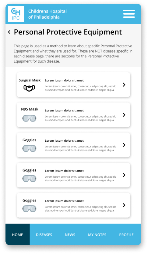
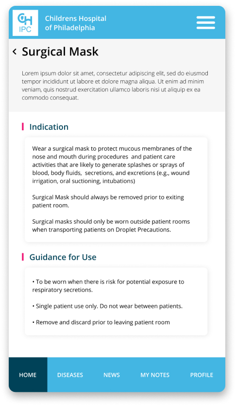
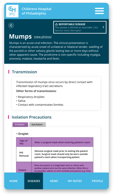
Mid-Fidelity Usability Testing – Findings:
- Users believed the content was quickly accessible
- Users liked how the content on the disease page (third screenshot above) was structured
- Users wanted a way to quickly access information on the bottom of the disease page instead of scrolling
03. High-Fidelity:
We finalized our wireframes with a change of branding, added some more icons, some more interactive elements, and more content in general. At this stage the team at CHOP requested to add additional content. Integrating new concepts and features resulted in an extended design process.
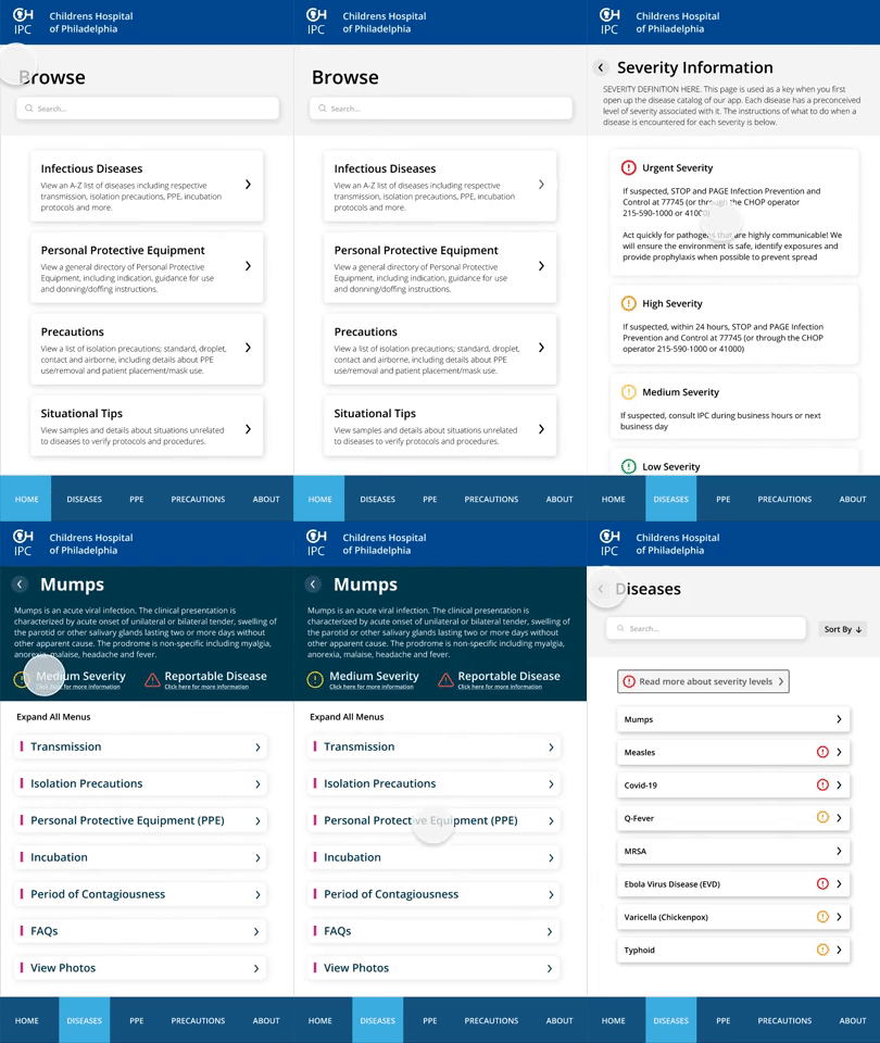
High-Fidelity Wireframes + Final Task Flows:
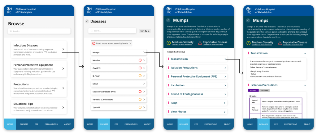
Task Flow #1: Navigating to a Disease Page
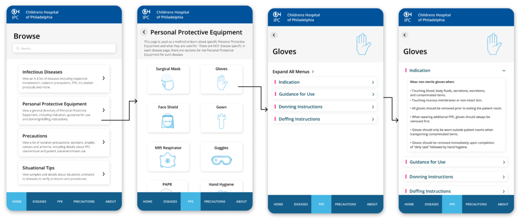
Task Flow #2: Navigating to a Personal Protective Equipment (PPE) Page
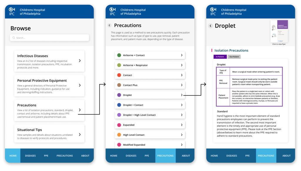
Task Flow #3: Navigating to a Precautions Page
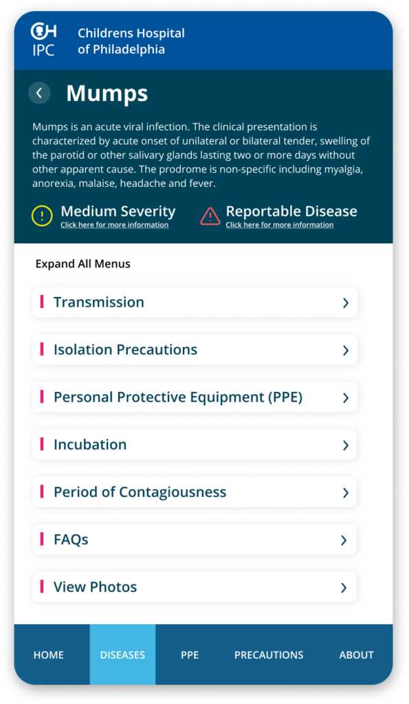
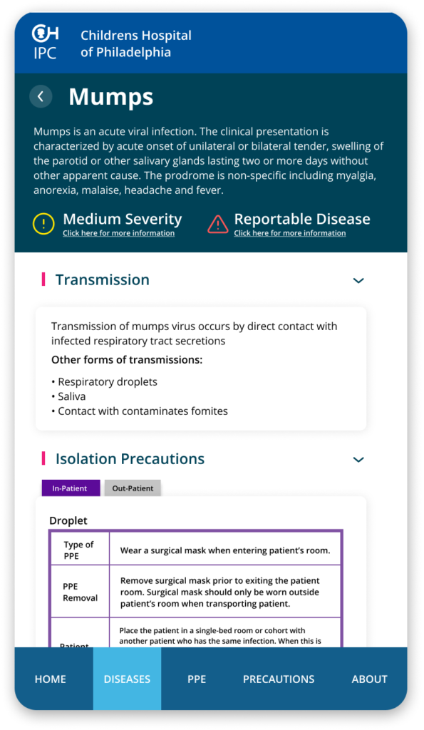
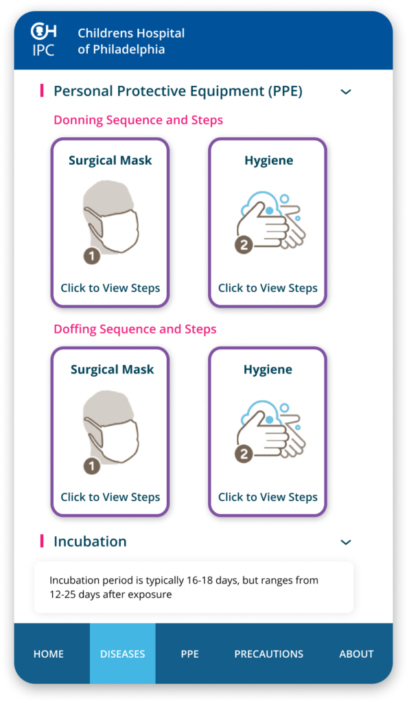
Any time a patient comes in, physicians and nurses diagnose them with a disease, and refer to a document that contains all the respective information. Through multiple usability testings, we concluded that the users found this structure most feasible for locating the necessary information quickly.
The focus on this page was largely on organizing information. Each disease is structured as such, and this page is the primary use case. Users felt that the drop-down interaction was effective in being able to choose and view the information they needed instead of excessive scrolling.
Takeaway
Physicians and nurses excessively contacted the Infection Prevention and Control team daily regarding information that is accessible via documents. Physicians and nurses were unable to quickly access these documents when patients come in with a disease.
We solved this problem by developing a prototype concept of an app that consolidates all necessary information onto users phones instead of scrambling for unorganized documents, or spamming the Infection Prevention Control team with calls. This project has been approved by the team at CHOP and will be integrated soon! Some user feedback below:
“This app is easy to use with information in a prioritized format so that what we need to see and what we want to see is clear and succinct.” – Dr. Dhang, Outpatient Physician
“I would use this app before calling the Infection Prevention Control team to find information ay my fingertips knowing that it is CHOP approved in terms of the information it provides. I see this as a “go-to” resource for nurses in everyday practice and a good learning tool for new nurses.” – Janine Cockerham, Nurse
“This app is super easy to use. The organization and color coordination of the app make it easy to navigate for the desired information. This app will enable me to find what precautions my patient may need or when they can come off precautions on the go instead of having to sit down and log into my computer. This will save me so much time in my daily routine!” – Janine Cockerham, Nurse