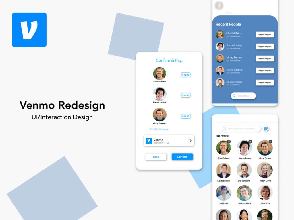
Background
For this project, I took inspiration from an Interaction Design class and focused on applying interaction design principles within the Venmo mobile app. The mobile app currently satisfies basic user needs, but I decided to take it up a notch with the microinteractions. I focused on retaining both conceptual and mental models when a user would experience new interactions. Despite it being an interaction design project, I recognized that although high-quality design is important, the usability must be functional and meet basic user needs.
User Persona
Adam went out to dinner with 10 friends and decided to pay for the bill. His friends agreed to venmo him once the money was all settled. Adam frequently uses Venmo as if it’s another one of his credit cards. He relies on it to quickly send and receive money with friends and family.
Needs:
- A quick method to send money
- To send money to one person
- To confirm it was successful
- To keep track of transaction
Pain Points:
- Cannot send one payment to multiple people at once
- Too many steps to get to a user profile
- IA on homepage
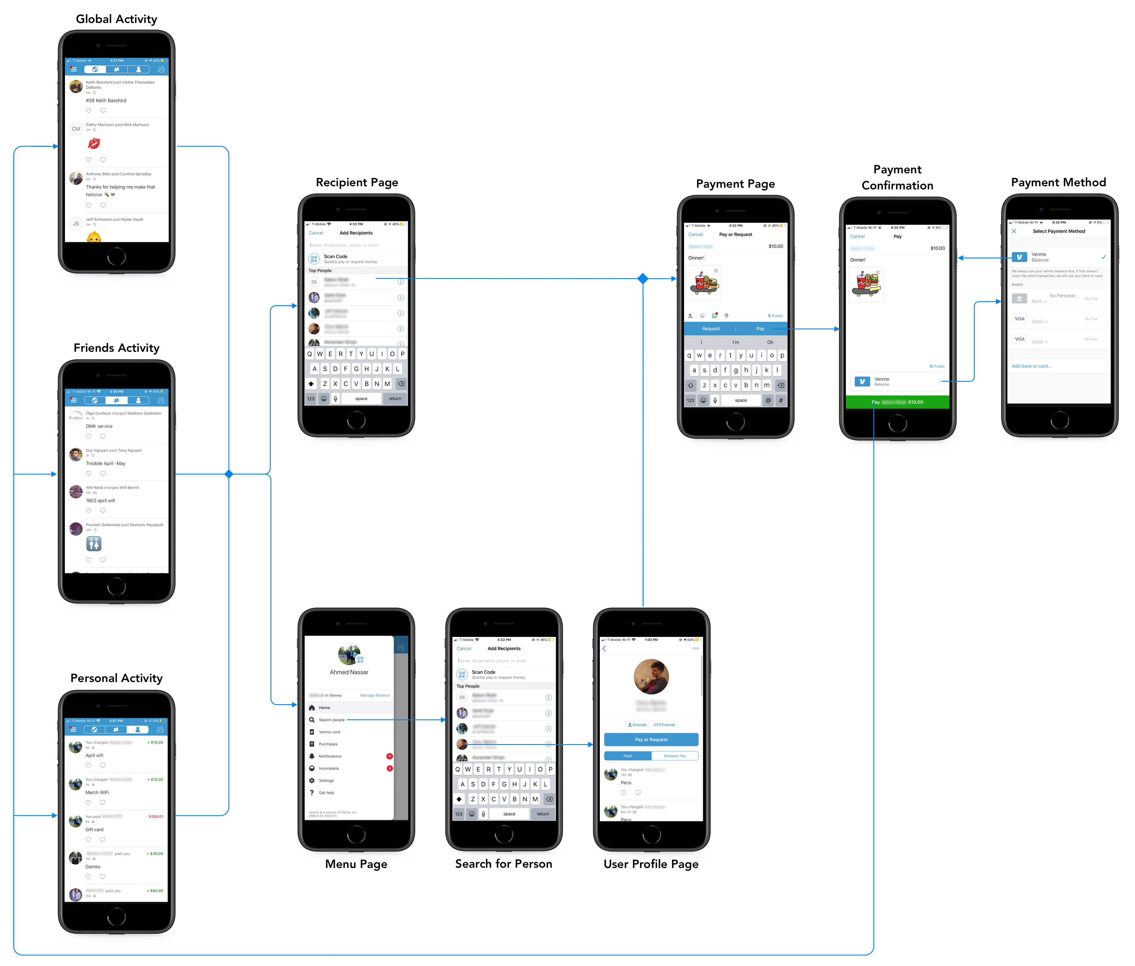
Task Flow Diagram:
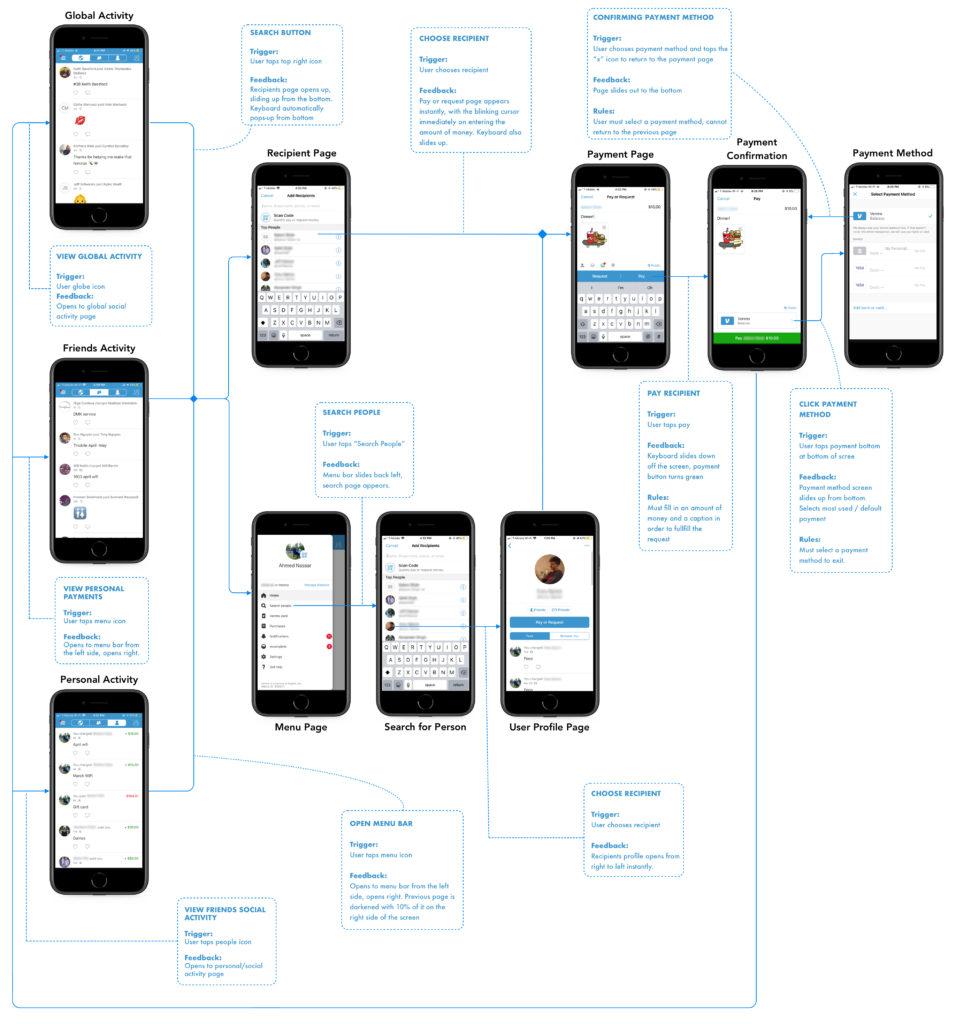
Interaction Guides Diagram
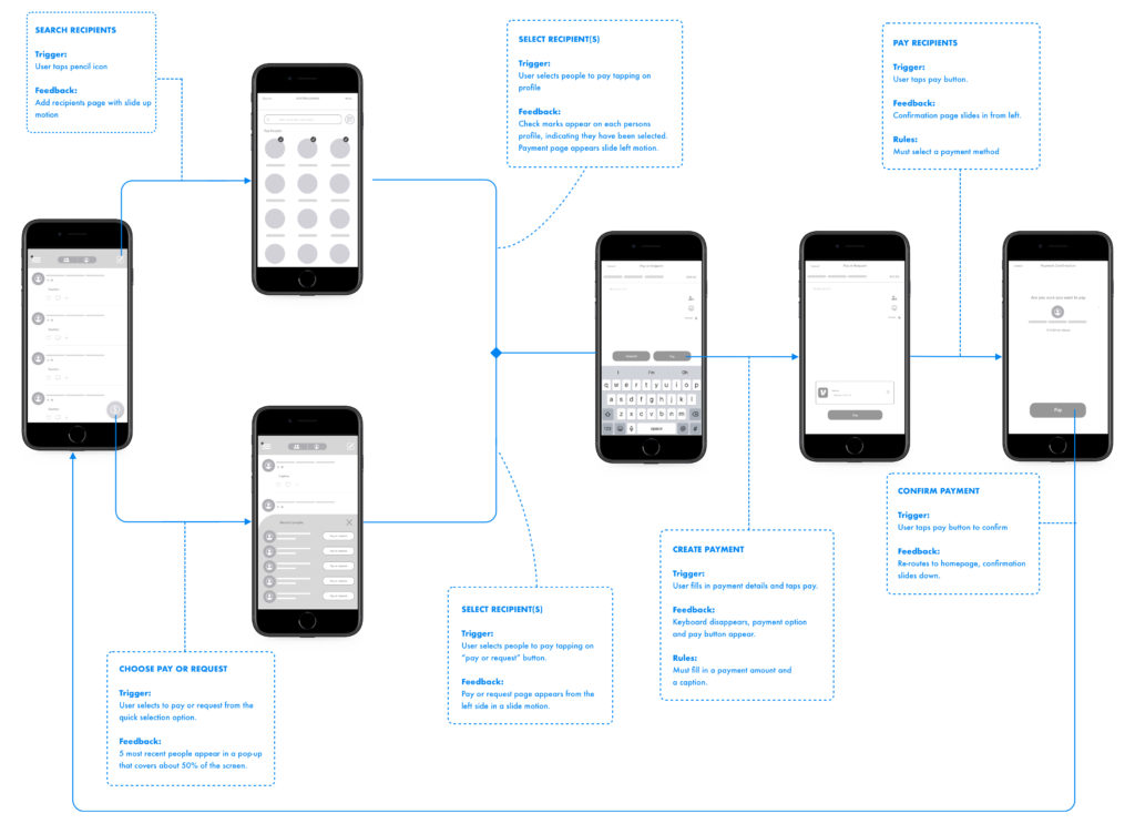
Microinteraction Sketches

Wireframes

Wireflow Diagram
High-Fidelity Designs + Task Flow
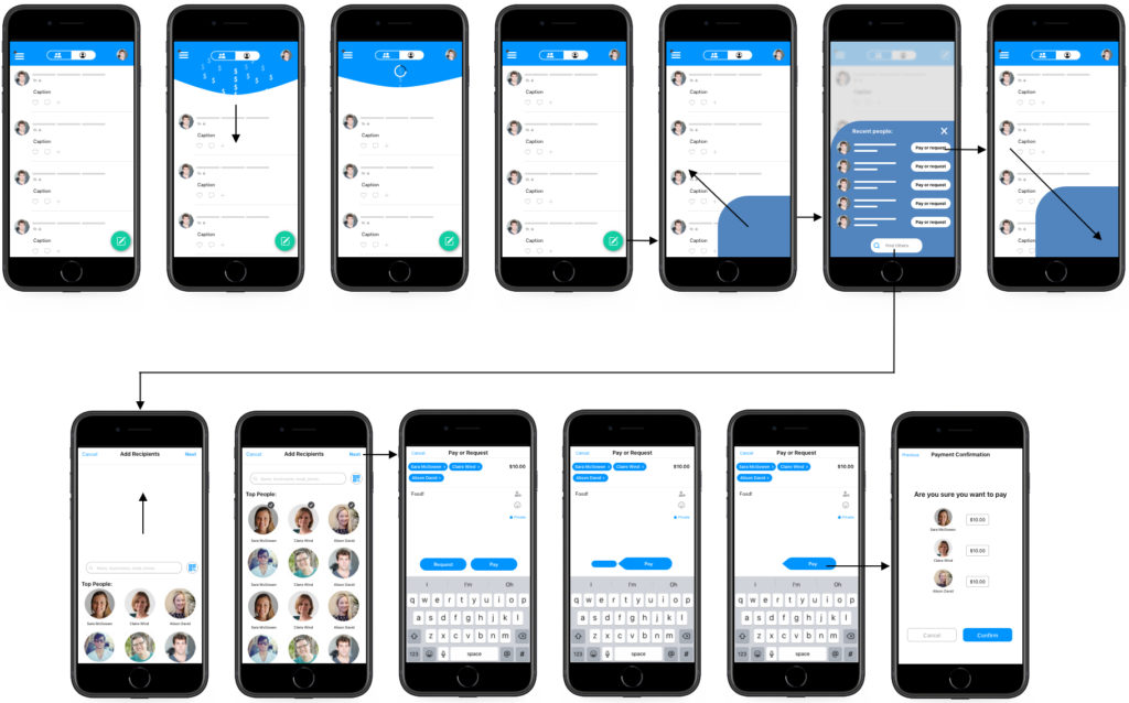
Final High Fidelity Designs
